

There was one quality in Matisse’s paintings that I kept returning to during the Chez Matisse exhibition at H’ART Museum in Amsterdam. It wasn’t a particular colour, subject, or composition. It was the way the paint sat on the canvas.
In some of the paintings, especially when I moved closer, there seemed to be surprisingly little paint. The brushstrokes were separated. There were spaces between colours. Parts of the canvas remained visible. Sometimes a stroke looked as if it had simply been placed there once and left alone.

From very close, it could almost feel unfinished. Then I would move backwards and everything came together. That contradiction fascinated me: unfinished, but complete.
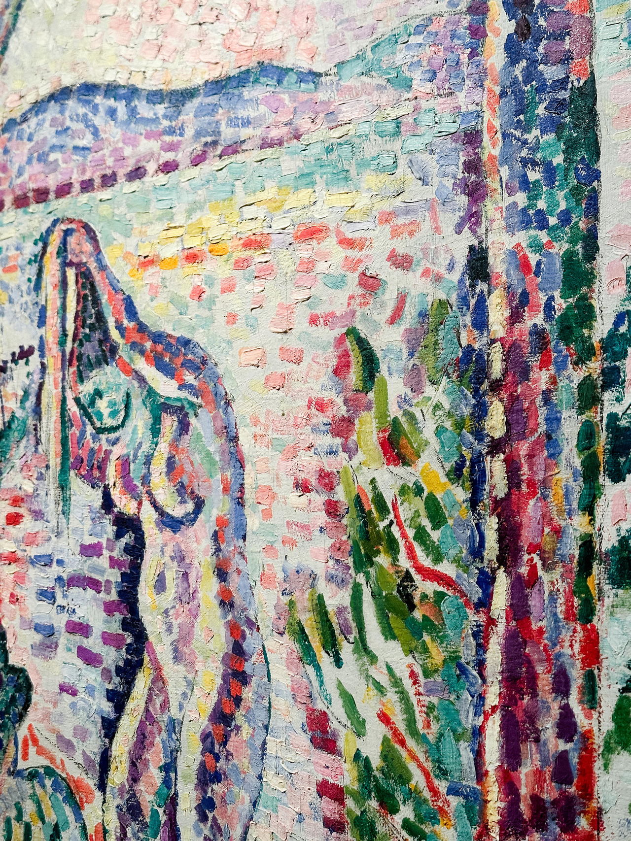
I noticed it particularly in Luxe, calme et volupté. Up close, the image breaks apart into individual strokes and patches of colour. Matisse was working at the time with ideas from Neo-Impressionism, building forms through separate applications of colour rather than trying to create a completely seamless representation of what was in front of him.
But what interested me wasn't really the art-historical explanation. It was the feeling of looking at it. You can still see how the picture was made.
The brushstroke hasn't disappeared into the finished image. The canvas hasn't disappeared either. There is texture, separation, and space. Your eye has to participate a little, putting things together instead of having every piece of information perfectly resolved for you.
And I realised that this might be something I have been missing in my own photography.
I changed cameras recently, and since then I have been trying to understand why some of my newer files feel different to me. Technically, they are excellent. There is an enormous amount of information. They are sharp, detailed, and clean. In many ways, they give me more than my older cameras ever could.
But sometimes that is precisely the problem. They can feel too clean.
For years I photographed with older digital cameras, and there was something about those files that made it easier for me to create the texture and dimension I wanted. With my newer camera, I sometimes find myself working harder in the edit to stop the image from feeling so digital.
At first, I thought I was simply trying to recreate the colour of my older camera. But standing in front of these paintings made me wonder if colour isn't the whole problem. Perhaps what I'm looking for is variation.
Areas that are sharp beside areas that are soft. Texture beside smoothness. Detail beside something that has been allowed to disappear. Colours that don't necessarily need to be perfectly neutral. Shadows that don't need to reveal everything. Perhaps an image needs places where the eye can rest.
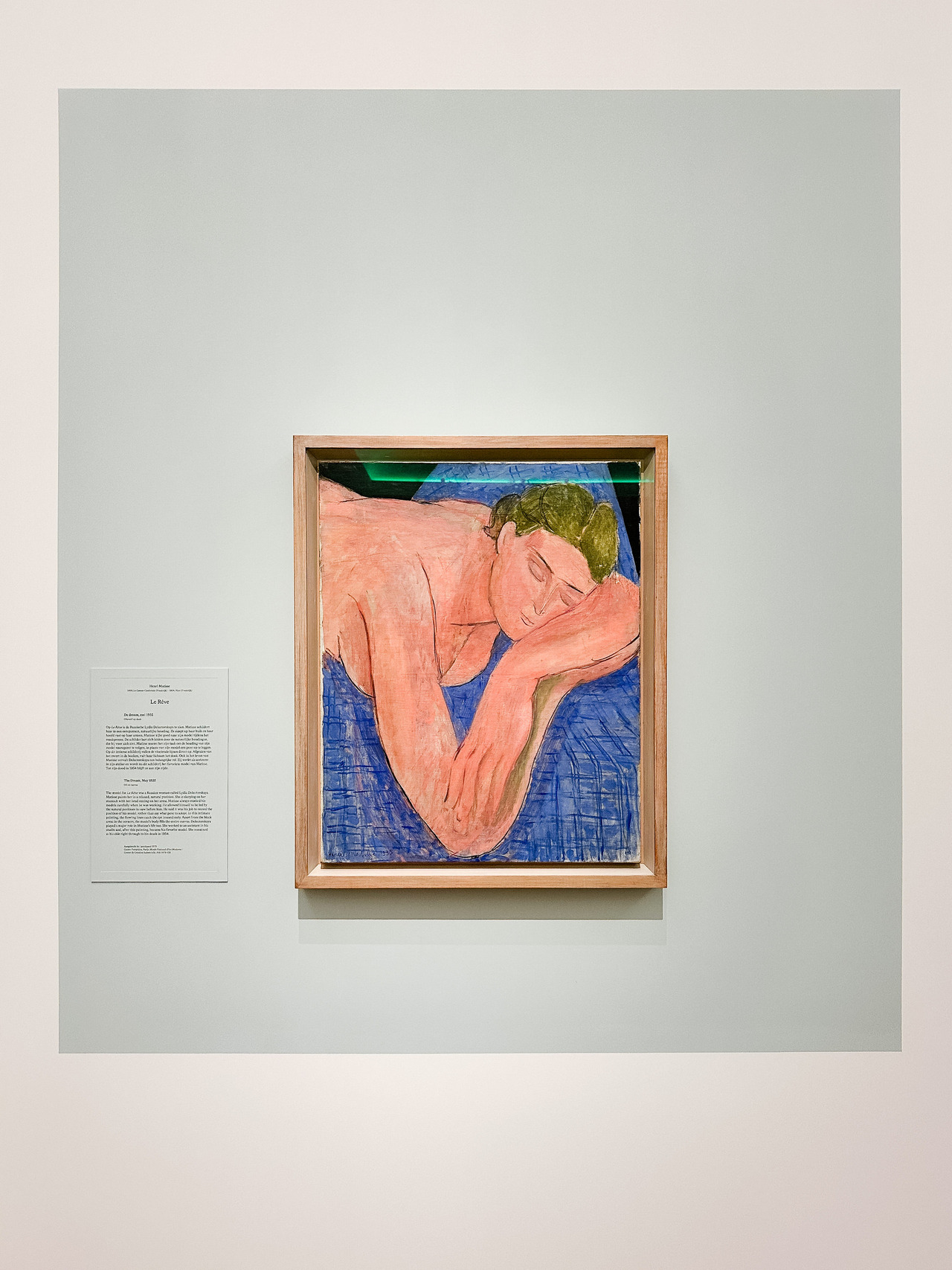
Photography technology keeps giving us more information. More resolution, more dynamic range, better autofocus, cleaner files, better noise reduction, and increasingly sophisticated ways of correcting almost anything afterwards. And, of course, all of that is incredibly useful. But more information doesn't automatically make a more interesting photograph.
The same thing happens when editing. It is very easy to keep going. Remove another distraction. Correct another colour. Recover another shadow. Smooth another transition. Sharpen another detail. We can continue until almost every imperfection has disappeared. But at what point does correcting an image begin to remove its texture?
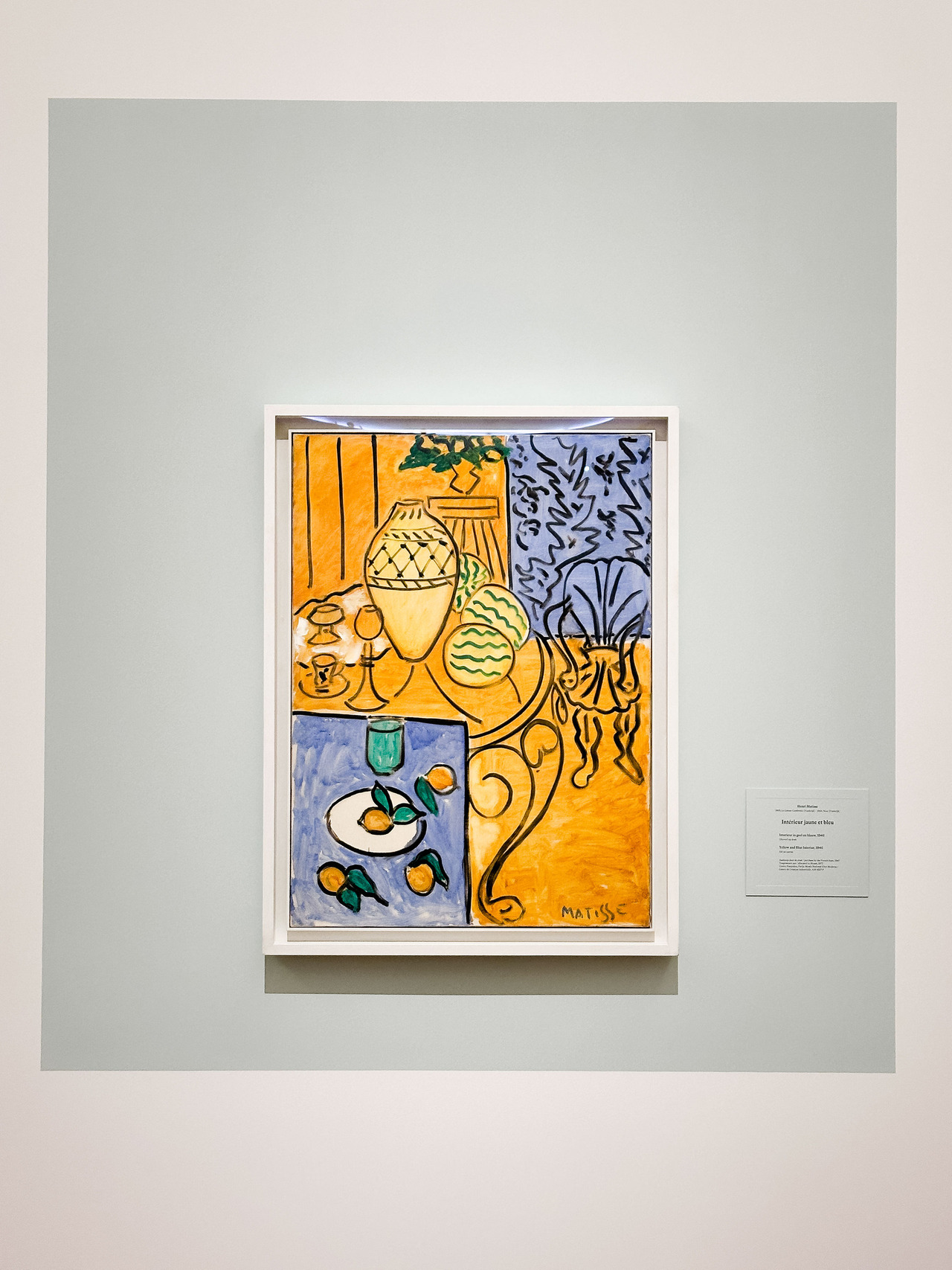
I don't mean that photographs should deliberately be badly exposed, out of focus, or poorly edited. And I don't think imperfection is automatically artistic. What interests me is something more subtle: how much do we actually need to resolve?
Looking at Matisse made me think about the difference between something being unfinished and something being unresolved. They aren't necessarily the same thing.
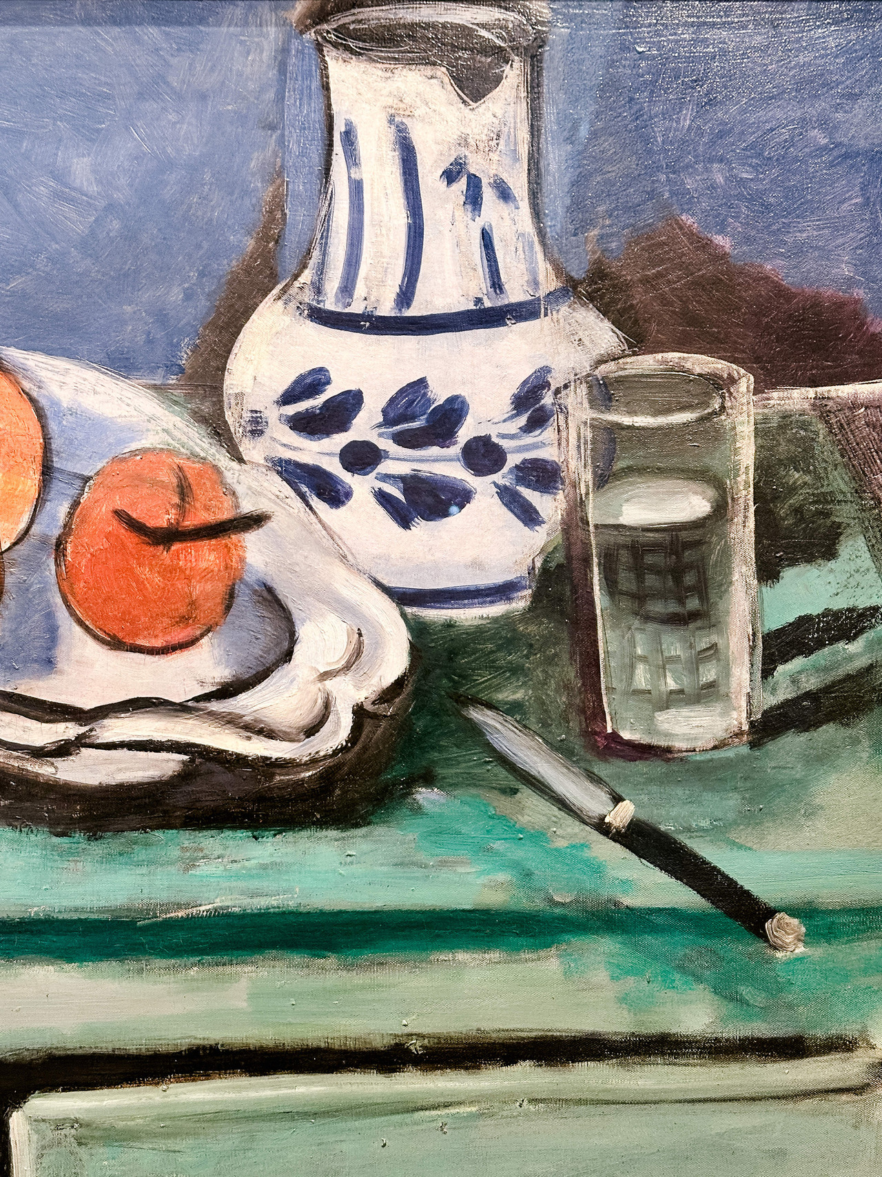
A painting can contain visible canvas and still say everything it needs to say. A brushstroke can stop without being blended into the next one. A colour can be unexpected and still feel right. The artist doesn't necessarily have to hide every decision that went into making the picture.
There is something beautiful about being able to see the construction.
And perhaps photography can do that too.
A photograph doesn't have brushstrokes, but it has its own evidence of how it was made. Grain. Movement. Depth of field. Light falling unevenly across a face. A colour cast from the environment. A highlight that becomes almost white. A shadow that remains dark. A background that doesn't need to explain itself completely. These things can be treated as problems, or they can become part of the photograph.
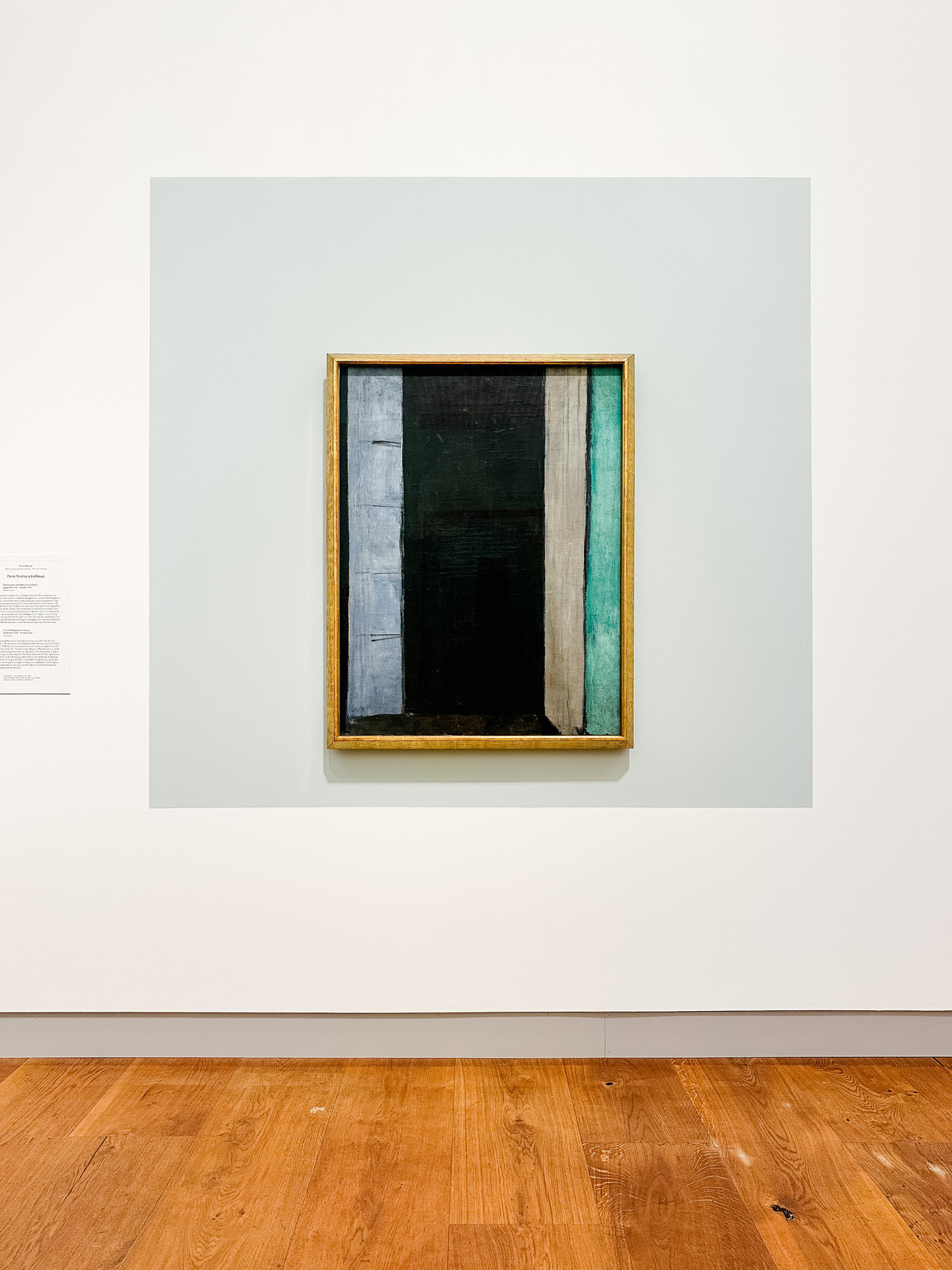
This is particularly interesting to me now because I've been thinking so much about green. Amsterdam has green everywhere: reflected from trees, canals, painted façades, parks and the changing light. For years, I was very conscious of eliminating colour casts and trying to make skin tones as neutral as possible.
Now I'm questioning that instinct. If the environment really was green, why should every trace of it disappear?
I don't want green skin simply for the sake of having green skin. But paintings have made me much more curious about how far colour can move away from literal reality while the person still feels completely believable. Matisse is certainly not the only painter who has made me notice this. I've seen greens in painted skin many times, and once you start noticing them, you see them everywhere.
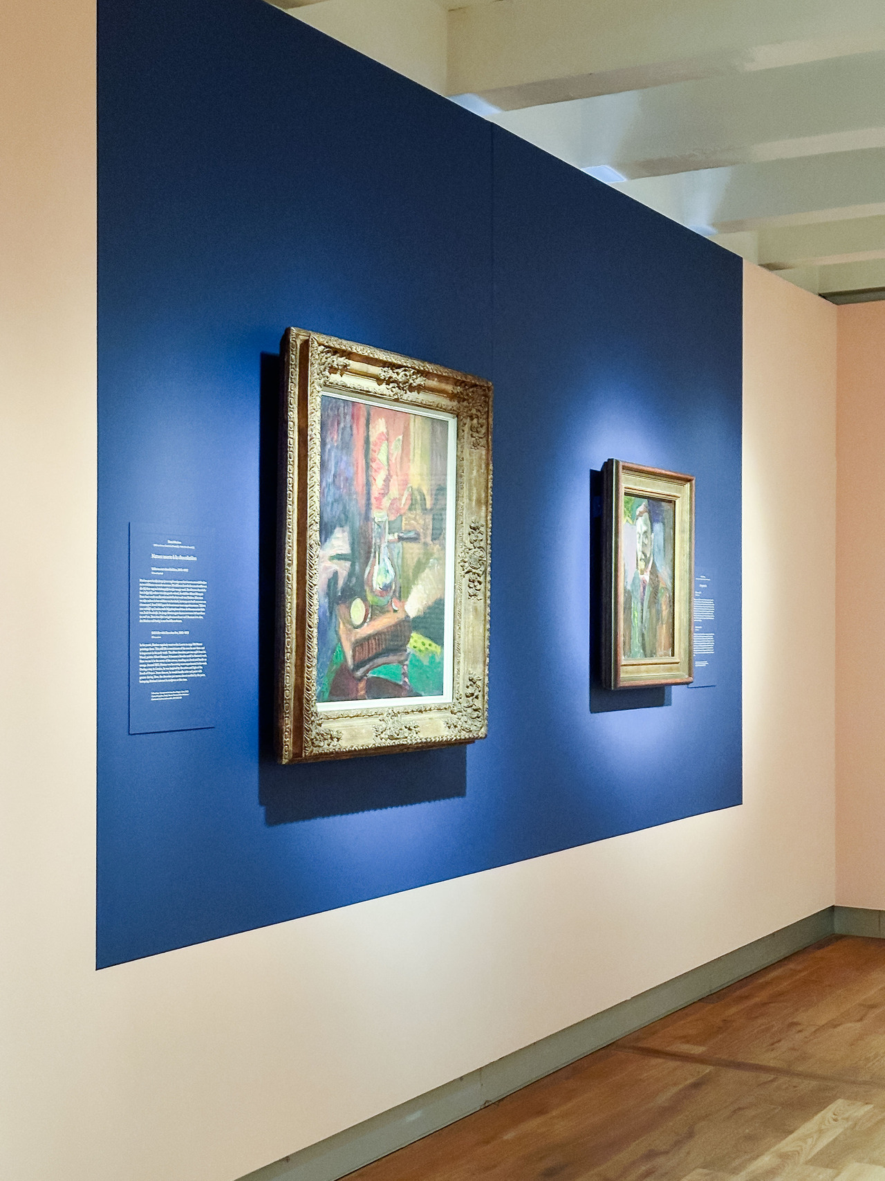
The question becomes less Is this colour technically correct? and more Does this colour belong to the image? That feels like a very different way of editing.
The same applies to texture. Maybe my goal with my newer camera shouldn't be to force it to imitate an older camera perfectly. Perhaps I need to understand what I loved about those older files and then find a new way of creating that feeling with the equipment I use now. I don't want worse image quality, what I want are images that breathe.
I want enough detail to describe the moment, but not necessarily so much perfection that nothing is left for the eye to discover.
That is probably why those Matisse paintings affected me so much. Standing very close, I could see all the places where the image seemed to fall apart. Then I stepped backwards, and it didn't feel incomplete at all. It felt finished.
Maybe finishing an image isn't about adding, correcting or resolving everything we possibly can. Maybe part of knowing when a photograph is finished is knowing what to leave alone.
Joanna Pantigoso
Your Vacation Photographer in Amsterdam
About the exhibition: Chez Matisse at H’ART Museum in Amsterdam brings together works by Henri Matisse and other artists, following the development of his work and the artistic influences and exchanges surrounding it.
Affiliate disclosure: This article contains affiliate links. If you book through one of them, I may receive a small commission at no extra cost to you.


